
| |


A Range of Effects
Unity.
Arrange the elements of your yard to create a unified picture-one in which the viewer's eye travels easily over the various elements, seeing them as parts of a whole. Here, two different borders of trees and shrubs both have a harmonious effect. In the top arrangement, the various sizes and shapes blend together casually; at bottom, the pattern of small and large plantings has a more formal unity.
|
|
 
 |
|
| |
Focal Point.
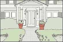
An element that attracts the eye is a focal point; it may be a door, bench, garden pool, arbor, specimen plant, or sculpture. Focal points are often at one end of a central axis, as at top right. The symmetrically planted flowers and shrubs accentuate the walk and draw the viewer's attention to the focal point-the front door.
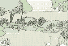
Another way to highlight an element is to place it in an area where it stands out; this can be off-center, as with the bench at bottom right. The shape of the garden leads the eye to the bench-the focal point for this view.
|
|
 |
|
| |
Balance.
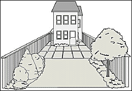
All landscape elements have a visual "weight". Good designs often balance their elements-large and small, light and dark, coarse and fine, dense and open-around a central point. In the asymmetrically balanced view, each side is different but the weights are similar: the group of shrubs balance the tall tree. A simpler route to balance would be through symmetry, designing a yard so that its two sides almost mirror each other.
|
|
  |
|
| |
Rhythm.
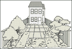
The repeated use of similar patterns or shapes creates a visual rhythm by drawing the eye from one area to the next. Here, the outline elements-the rectangular paving blocks, the planting beds, and the two trees along one side of the yard-provide a pleasant sense of movement.
|
|
  |
|
| |
Contrast.
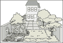
Alternations in materials, plants, textures, or lines can enliven a design. In this example, the stone path adds a new texture, and its curving shape breaks up the yard's straight lines. The vine-covered screen provides some variety because it contrasts with the rest of the fencing, and the different shapes of the trees also add interest.
|
|
  |
|
| |
Designing with geometry.
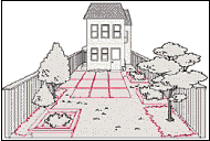
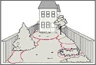
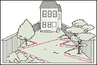
Geometrical arrangements of plantings and paving can play a major role in a landscape design. In the top example, rectangles and squares (right) reflect and extend the straight architectural lines of the house. Curves (center) do the opposite, posing a strong and intriguing contrast to the house lines. Triangles (bottom) direct the eye to a focal point-here, the expanse of lawn in the center.
Back <<
Gardening <<
|
|
|
|

|


