
| |
I would like to remake my home with new paint colors but don't know how to get started. What is the best way to select colors for a room?
At Achla Home we consider color to be the single most powerful decorating tool. Color can affect your mood, make rooms appear larger or smaller, provide continuity or jumble, and provide welcoming warmth or alienating cold. This is a lot of pressure to put on selecting your colors!
With the number of choices available it is no wonder you are confused on where to start in selecting your paint colors. To answer your question we would like to first review some basics on color that will help you in making your choice.
First, colors can evoke emotions and moods. Some of the responses to color are inborn, while other responses are cultural perceptions or personal preferences. We'll review some basic color rules, but remember that these are only guidelines, and that your personality and cultural upbringing can influence your perception of these colors.
|
|

| |
Black - is actually not a color, but the
absence of color. When light hits a black object, none of the light is reflected back, it is absorbed. Black is a very modern and stylish color creating a dark, mysterious mood. However, for those mysterious amongst us we should remember that black absorbs light, and when used in abundance such as on a large sofa or a wall covering, it will make a room appear smaller and require significantly more lighting. It is for this reason that we suggest using black sparingly, for accent furniture and accessories.
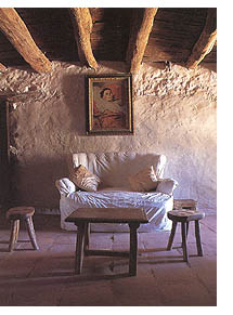
Gray - gray is a non-color, a combination of black and white. Gray is the color of rain clouds, creating a somber mood. Gray is a shade that needs to be used carefully, although it will not make a room appear dark, too much gray within a room will have a dull, monotonous feel. Gray is easy to use as an accent, such as on a wall, combined with colorful more dramatic art and window treatments.
Orange - orange is an active color denoting motion and unrest. Used in softer shades it can be used as an accent color to create a cool trendy d�cor, think of pumpkin, terra cotta, and peach.
Green - green is the color of the forest and meadows, and as such, provides natural, restful comfort. Green acts as a great color for blissful bedrooms, family and living rooms, providing a place of peace, rest and relaxation. Green is perfect for balancing the power and heat of red, particularly with yellow-greens like sage, celadon, or avocado. It can also be used to transition the depth of true blues by creating turquoise or aqua.
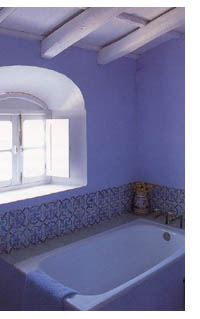
Violet - the color of flowers, violet has traditionally been used for celebrations, ceremony and royalty. It is the coolest of colors in the spectrum. Violets and purples can add a twist of the unexpected to a neutral room. However, violet is difficult to work with to create the correct blend and mood, so if you are wanting to add violet color and accents, consult with friends or even a professional to be sure the effect is as intended.
|
|

White - white is a combination of all colors. When light hits a white object, as opposed to black which absorbs all of the light, the white object reflects all of the light. White is the color purity, peace and joy. White rooms appear larger, requiring less artificial light to create a bright airy feeling. White however can be difficult to maintain in its clean pristine state.
Red - red is a stimulating warm color, defined by
heat and fire in nature. Red exudes passion, desire, royalty and sexuality. Want to spice up your bedroom? Forget the sexy lingerie and paint a wall red! Red can add drama to a room by creating a hot focal point, perfect when used sparingly in bedrooms, kitchens, and vibrant living spaces. However, if you want a room to provide peace and comfort, the drama of the red colors can upset the balance.
Yellow - yellow is the color of the sun, stimulating and comforting all at the same time. Yellow, and related tints such as cream, brown and beige, represents a good base color, balancing feelings of activity with tranquility. However, we have seen this color at times overused, with various shades of beige and yellow room after room. In homes with this color scheme, the mood can be shallow, unless dramatic artwork and furniture, or more substantive shades such as red or blue accent walls are added to liven up the monotone appearance.
Blue - blue is the color of the ocean and the sky,
generating moods of coolness and rest. The color is associated with sensitivity and thoughtfulness. Many corporate logos use blue to denote feelings of depth and stability. Blue can be used as an accent to relax the heat of red, orange, or yellow color schemes. Used in dark shades with abundance however, the color can cause a room to look small, and produce melancholy in your guests.

| |

Now that we understand some basics about the mood colors generate we now need to understand how to combine colors to create a balance of the moods.
Color wheel »
Top

|
|

|
|
|

|


